A blue ring, torn edges and a sharp diagonal: looking at what happens when a graphic refuses to close.
WearLoud studio · Artwork notes added · Revision 1
Full digital artwork · Signal CutAI-assisted digital artwork · Concept study
Start with the open centre
Signal Cut puts its quietest area inside one of its strongest shapes. The blue ring almost closes, but torn blocks interrupt its edge. Your eye can complete the circle without the image drawing every part of it. That open centre gives the surrounding fragments somewhere to move around.
Follow the cut
The black diagonals behave differently from the ragged blue edges. One feels sharp and direct; the other looks uneven and layered. The tension comes from putting both kinds of edge in the same frame. Blue carries the large shape, while the darker cuts stop it from becoming a tidy badge.
Then step back
In the detail, flecks and rough borders become prominent. In the full composition, the stacked lettering at the top and the large broken ring take over again. Neither view tells the whole story alone. The useful comparison is between a shape you recognise quickly and the irregular edges you notice after a second look. This note is a reading of the finished digital concept, rather than a record of how it was made.
Digital artwork detail
A selected area of the digital artwork. The grain is part of the image, not a photograph of printed ink or fabric.
A QUESTION TO SIT WITH
Which holds your attention more: the broken blue ring or the sharp black diagonal?
A reading prompt, not a preference vote. To respond, use the private interest form; an email and contact permission are required. Your note is optional and private.
These are AI-assisted digital artwork concepts made for this preview. The notes describe the visible composition; they do not document hand drawing or garment production.
Illustrated concept. A sample print, fabric appearance and final garment fit have not been verified.
A question for a physical sample
Does the open centre stay clear at the planned print size? A physical sample is needed to answer that.
A dark red flower leans away from fractured lettering. The composition finds its balance without making everything symmetrical.
WearLoud studio · Artwork notes added · Revision 1
Full digital artwork · Off-Centre BloomAI-assisted digital artwork · Concept study
Read the lean
The flower sits high and to one side, while the tall black lettering gathers below it. A curved stem joins the two areas without turning them into a centred emblem. Small leaves and a separate petal add pauses along that curve. The result feels deliberately unsettled, even though the composition remains easy to follow.
Let the letters carry weight
The lettering is not a neutral label beneath a picture. Its stretched forms, broken edges and uneven alignment make it part of the image. The red petals draw attention first; the black letters give the lower half enough weight to hold them. Open space around both keeps that exchange visible.
Look closely, then look whole
The detail brings out dark creases and scattered marks in the petals. Return to the full artwork and those marks become secondary to the larger relationship between flower and type. A close view can suggest softness or roughness, but it cannot tell us how a future garment will feel. Here it is a way to study the digital image, without treating illustration texture as evidence of a physical print.
Digital artwork detail
A selected area of the digital artwork. The distressed marks belong to the illustration; they are not a worn print or a fabric test.
A QUESTION TO SIT WITH
Would this composition still interest you without the red flower, or is the flower what makes it work?
A reading prompt, not a preference vote. To respond, use the private interest form; an email and contact permission are required. Your note is optional and private.
These are AI-assisted digital artwork concepts made for this preview. The notes describe the visible composition; they do not document hand drawing or garment production.
Illustrated concept. A sample print, fabric appearance and final garment fit have not been verified.
A question for a physical sample
How much of the petal texture survives at garment scale? That remains a sample-print question.
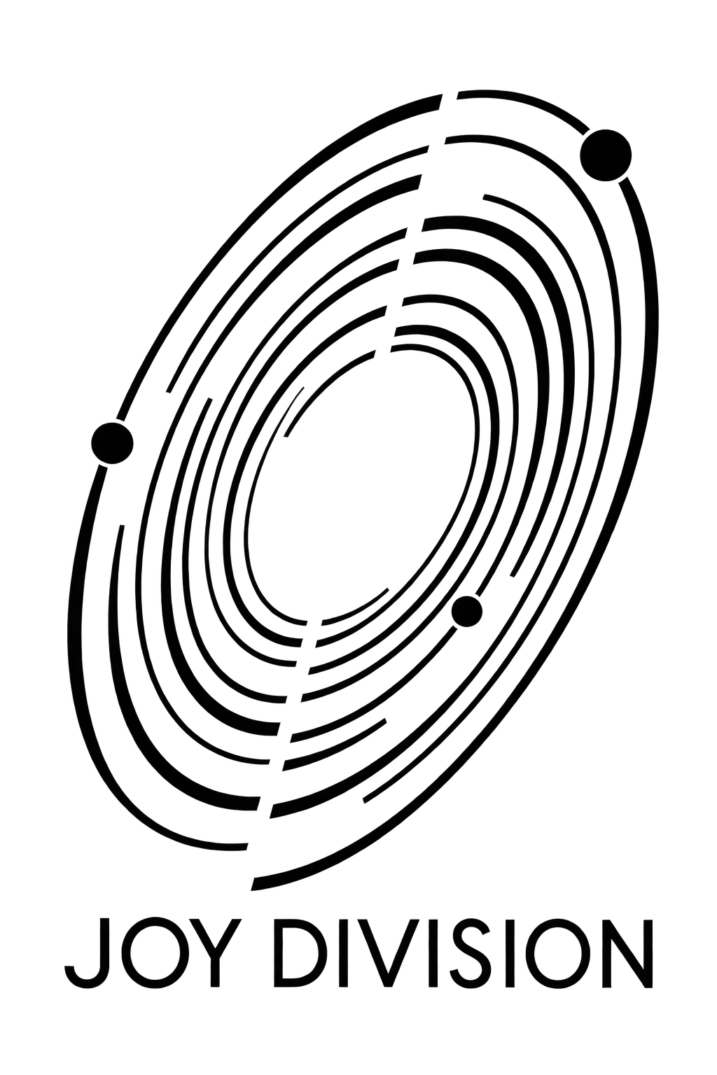
Open elliptical lines and three dark nodes make a graphic out of repetition, interruption and the space between them.
WearLoud studio · Artwork notes added · Revision 1
Full digital artwork · Echo OrbitAI-assisted digital artwork · Concept study
Notice what is missing
Echo Orbit uses repeated curves, but it does not close every loop. Gaps interrupt the tracks at different points, leaving the eye to connect them. The unprinted-looking space is part of the digital composition, rather than an empty area waiting to be filled. It stops the repeated lines from reading as one heavy patch.
Find the anchors
Three solid round nodes interrupt the lighter rhythm of the tracks. They are small compared with the whole orbit, yet their filled shapes make them easy to find. The tilted ellipse adds direction, while the straight line of lettering below gives the image a different kind of anchor. The graphic needs very little colour because its contrast comes from density and spacing.
Change the distance
From farther away, the orbit reads as one tilted form. Closer in, separate tracks, breaks and small differences in spacing become more noticeable. That shift is the reason to show both a full image and a detail. It also leaves an honest question for a future physical sample: the digital file shows the gaps clearly, but it cannot establish how each one will reproduce on cloth.
Digital artwork detail
A selected area of the digital artwork. Line spacing is shown in the source image; this is not a test of print sharpness.
A QUESTION TO SIT WITH
Do the broken tracks make this feel more open or more unfinished to you?
A reading prompt, not a preference vote. To respond, use the private interest form; an email and contact permission are required. Your note is optional and private.
These are AI-assisted digital artwork concepts made for this preview. The notes describe the visible composition; they do not document hand drawing or garment production.
Illustrated concept. A sample print, fabric appearance and final garment fit have not been verified.
A question for a physical sample
What line spacing is reliable at the final print size? The process and a physical sample still need confirmation.


 Echo Orbit ↗
 Cathedral of Sound ↗